See all wine label designs at Pinterest Perceval wine label collection.
Design and Art direction / (copywriter; Arthur Tanaka)
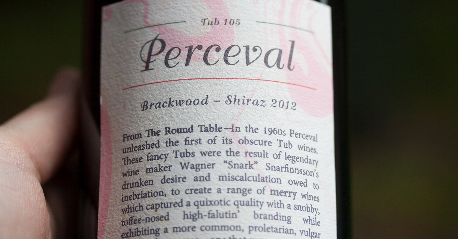
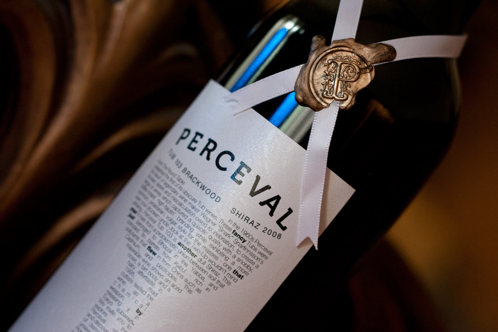
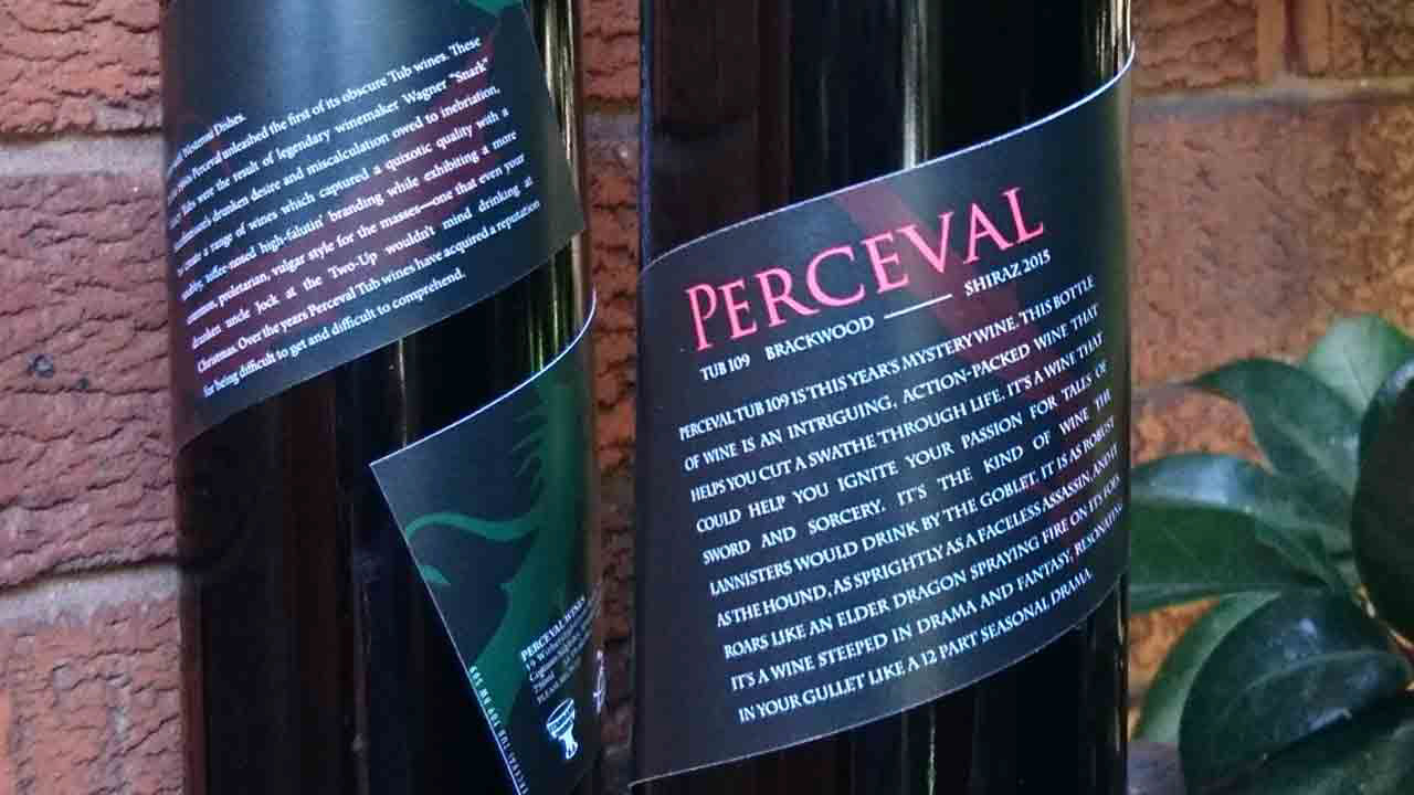
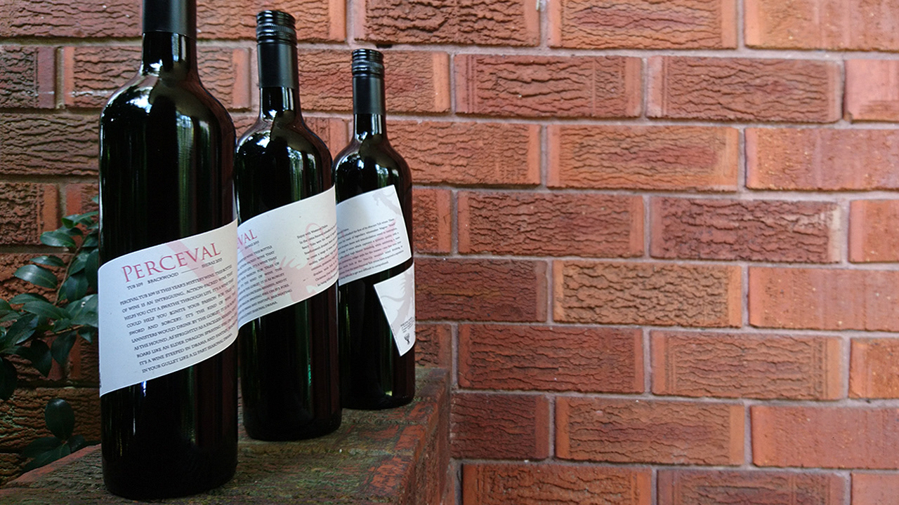
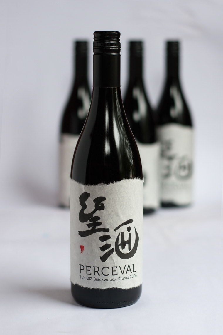
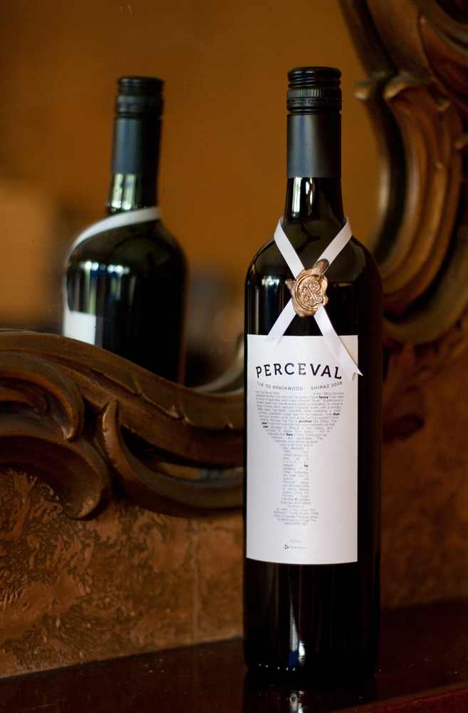
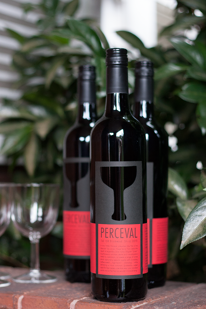
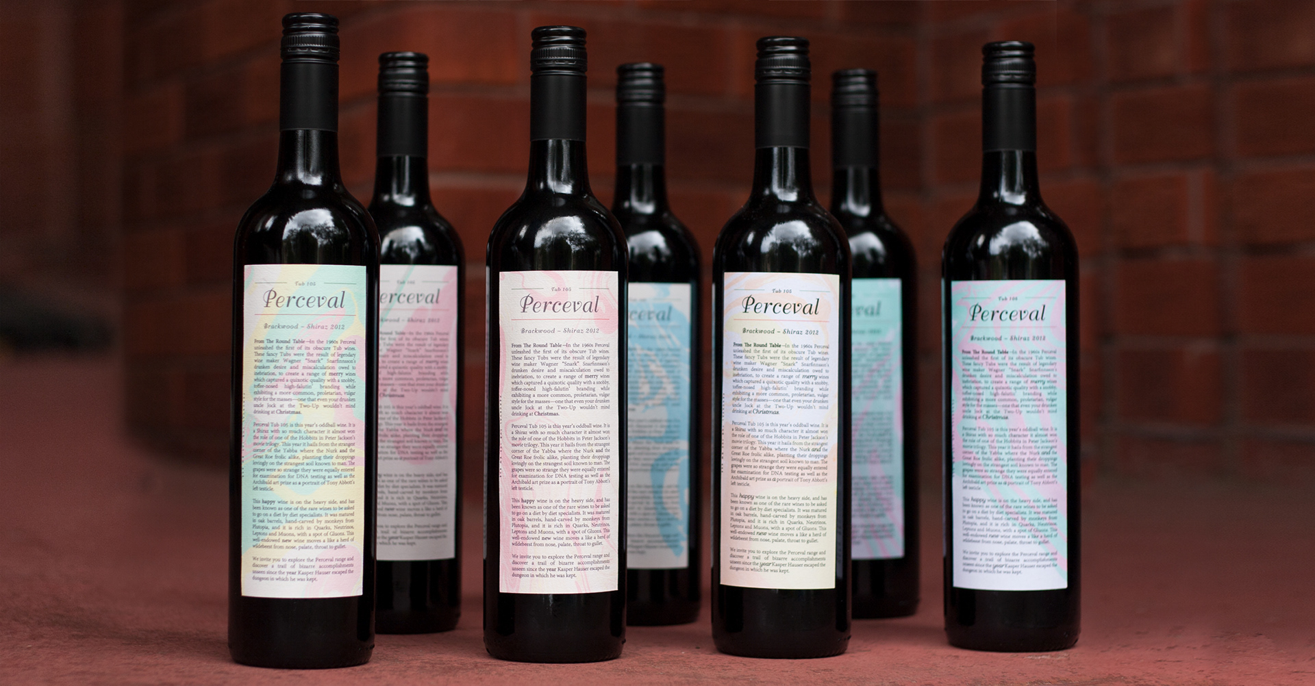
We have been producing wine labels every year for our family and close friends. The challenge each year is to develop a concept that could carry both the semiotic richness of the fictional wine label called Perceval after—Parsifal evoking the Grail myth as well as layering in the events of the year in a satirical write-up. The text of the wine is parodic while the visuals have to carry the key elements of the story of how Sir Perceval/Parsifal, the pure fool, attains the Holy Grail. The wine is always sourced from the Barossa Valley, a rich Shiraz from old vines, evocative of blood.
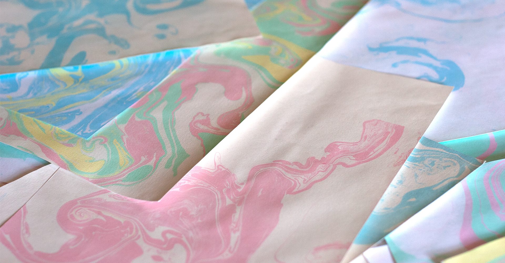
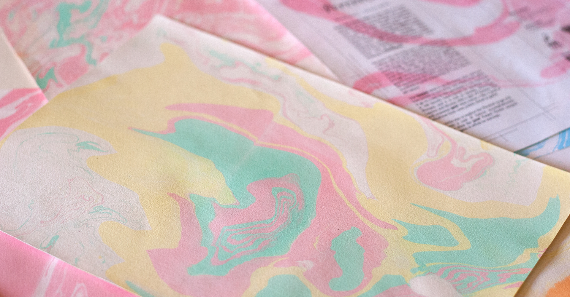
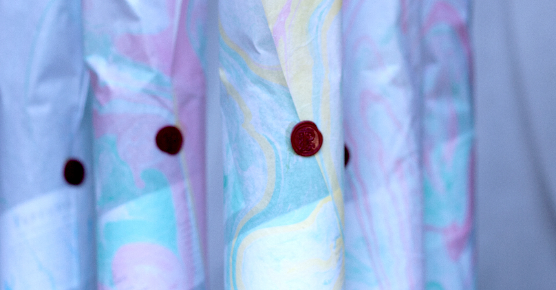
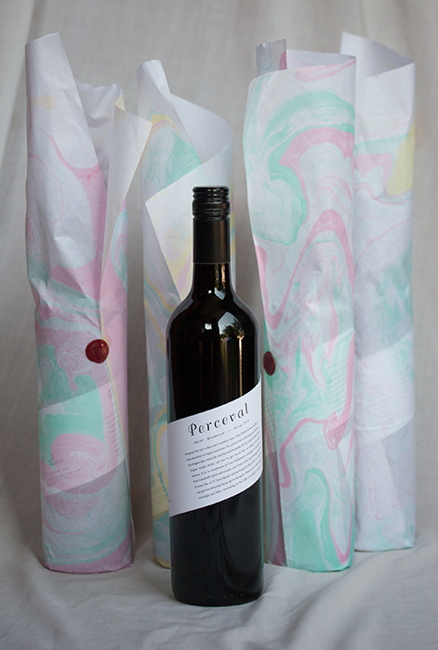
Japanese Marbling Art
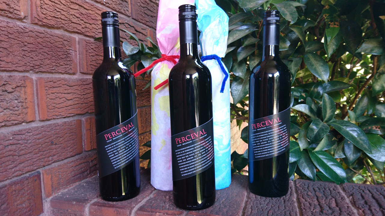
I encountered an art called Japanese marbling. I experienced various methods of using different textures of papers making absorb the colour inks, and I found Japanese Shoji paper is the best paper for this. I used these as wrapping paper. Different materials create different patterns, so each wrapping paper is unique.
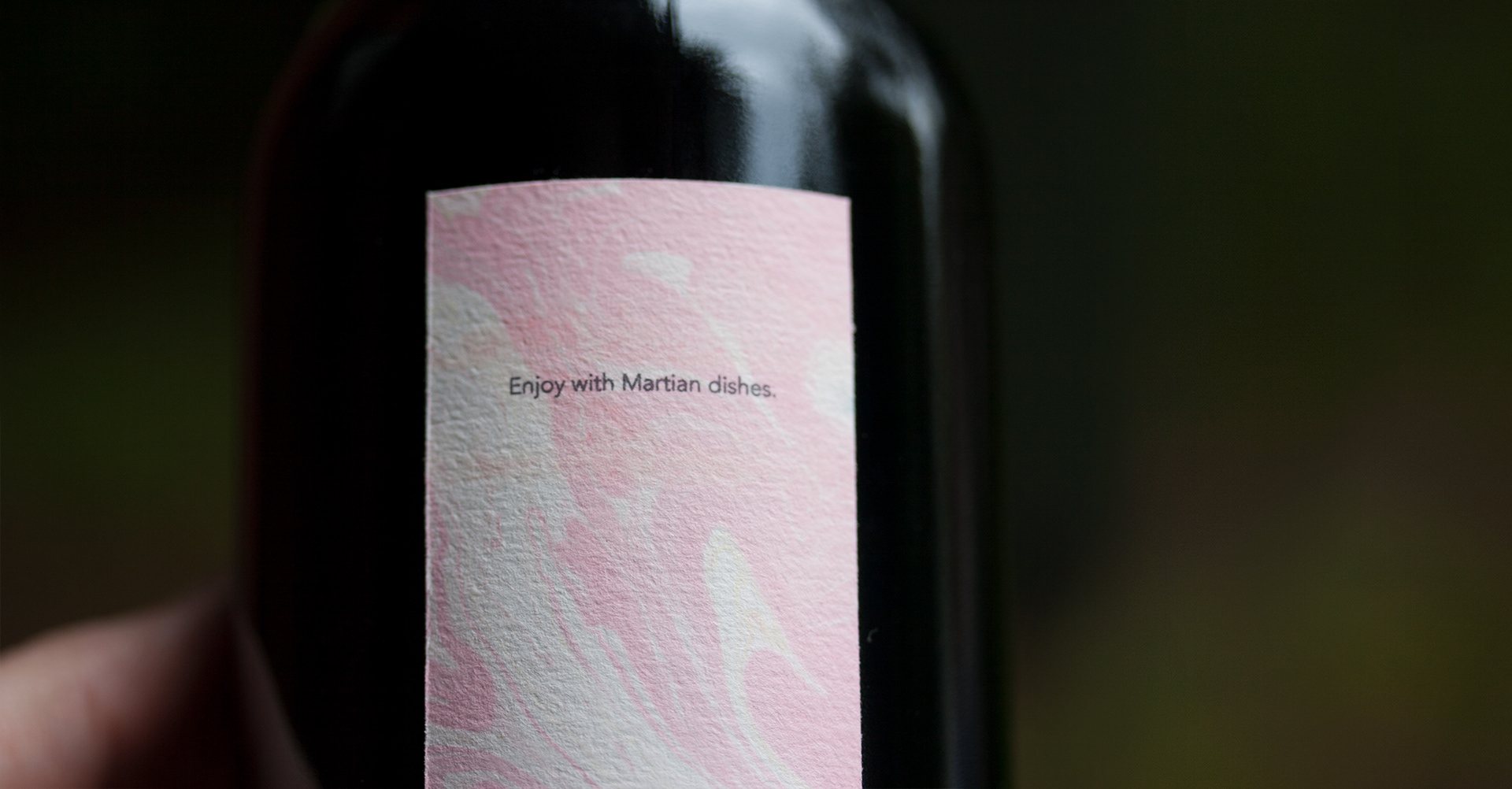
I keep this project apart from my digital work. It is experiencing and practising graphic design work. Having said that this project still considers some kinds of usability; “how people hold the bottle, pour the wine. I have to take into account the size of the label, and font sizes. For instance, the writing on the label needs to be more than legible; and the combinations of the texture of the paper and size may make it difficult to hold the bottle so they must be matched appropriately.
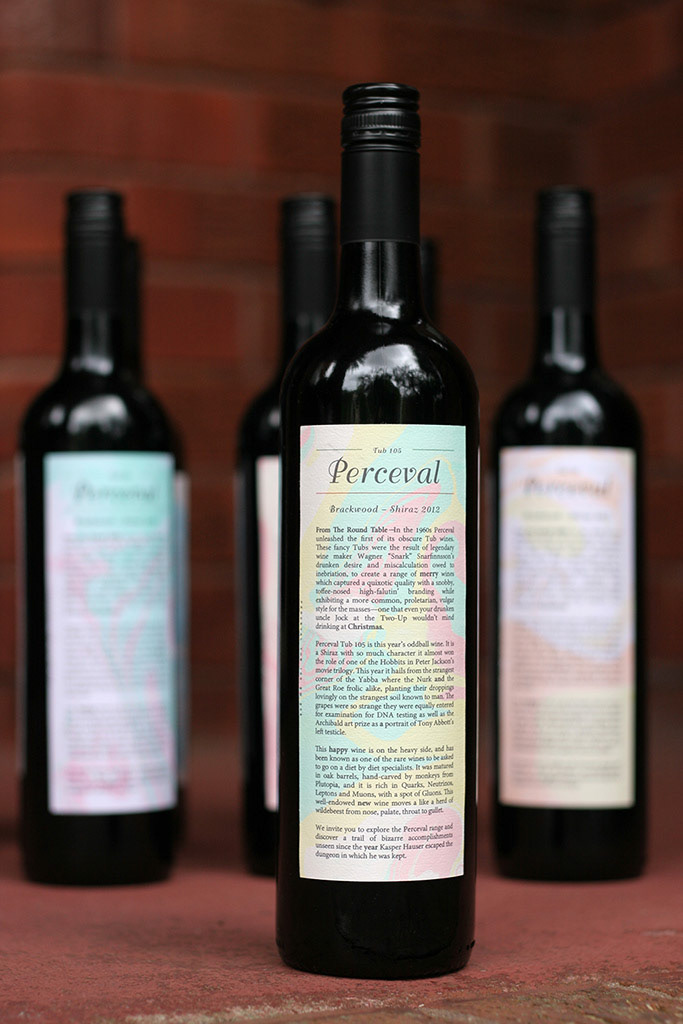
We have been producing wine labels every year for our family and close friends. The challenge each year is to develop a concept that could carry both the semiotic richness of the fictional wine label called Perceval after—Parsifal evoking the Grail myth as well as layering in the events of the year in a satirical write-up. The text of the wine is parodic while the visuals have to carry the key elements of the story of how Sir Perceval/Parsifal, the pure fool, attains the Holy Grail. The wine is always sourced from the Barossa Valley, a rich Shiraz from old vines, evocative of blood.
Japanese Marbling Art
I encountered an art called Japanese marbling. I experienced various methods of using different textures of papers making absorb the colour inks, and I found Japanese Shoji paper is the best paper for this. I used these as wrapping paper. Different materials create different patterns, so each wrapping paper is unique.
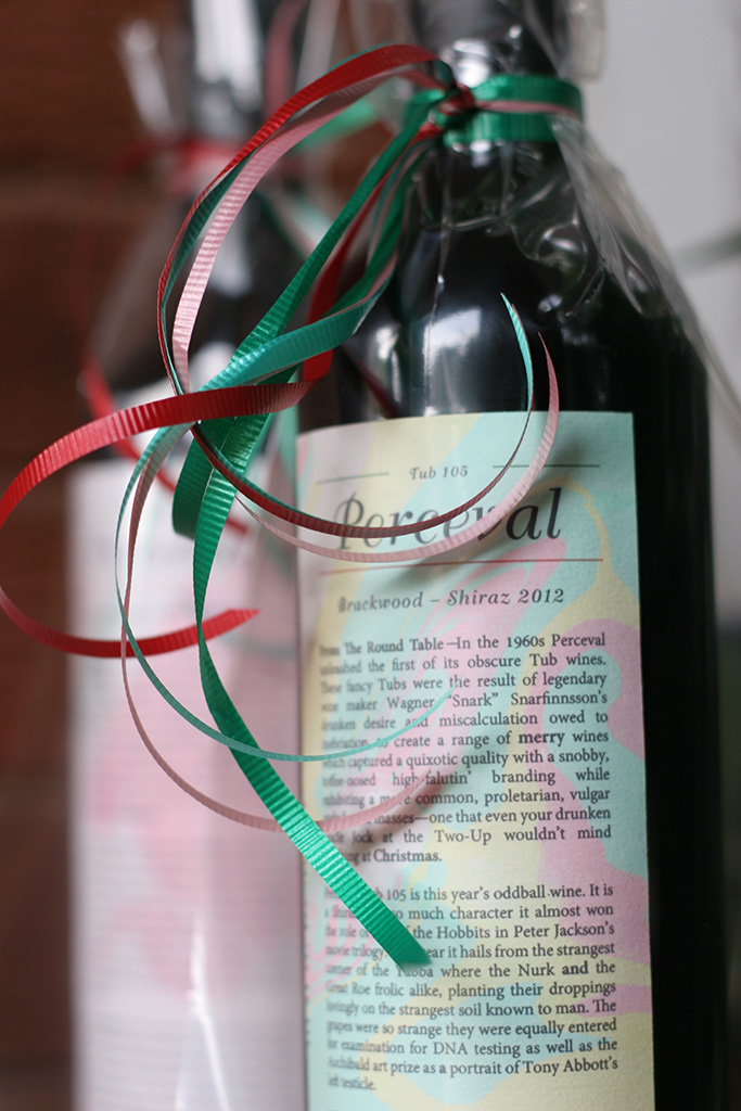
I keep this project apart from my digital work. It is experiencing and practising graphic design work. Having said that this project still considers some kinds of usability; “how people hold the bottle, pour the wine. I have to take into account the size of the label, and font sizes. For instance, the writing on the label needs to be more than legible; and the combinations of the texture of the paper and size may make it difficult to hold the bottle so they must be matched appropriately.