Project Details
The Problem
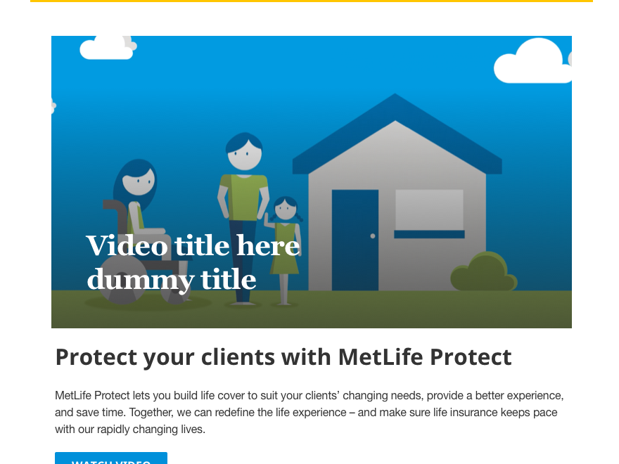
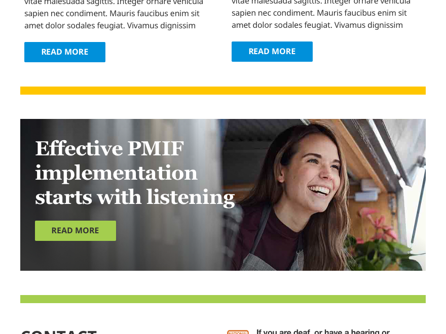
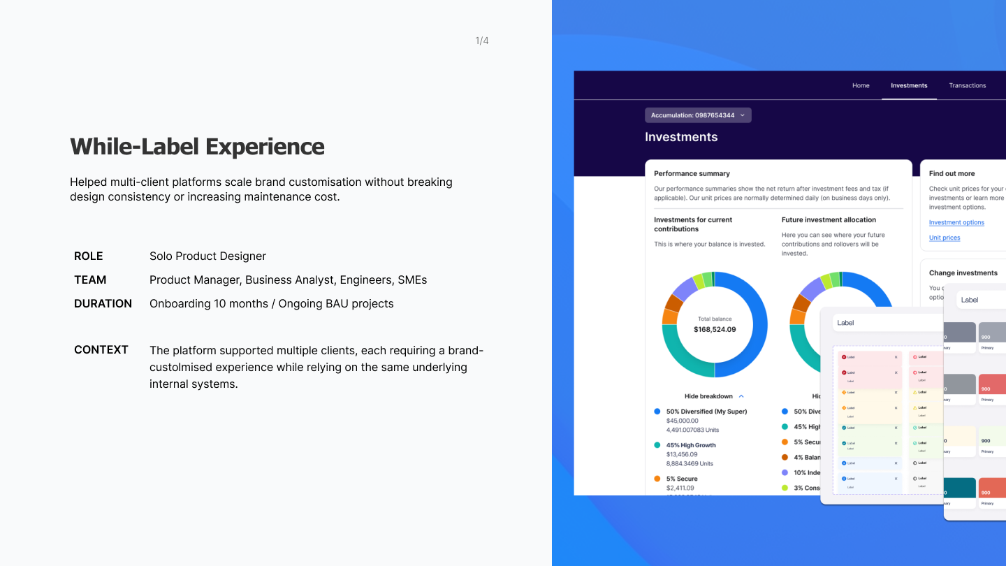
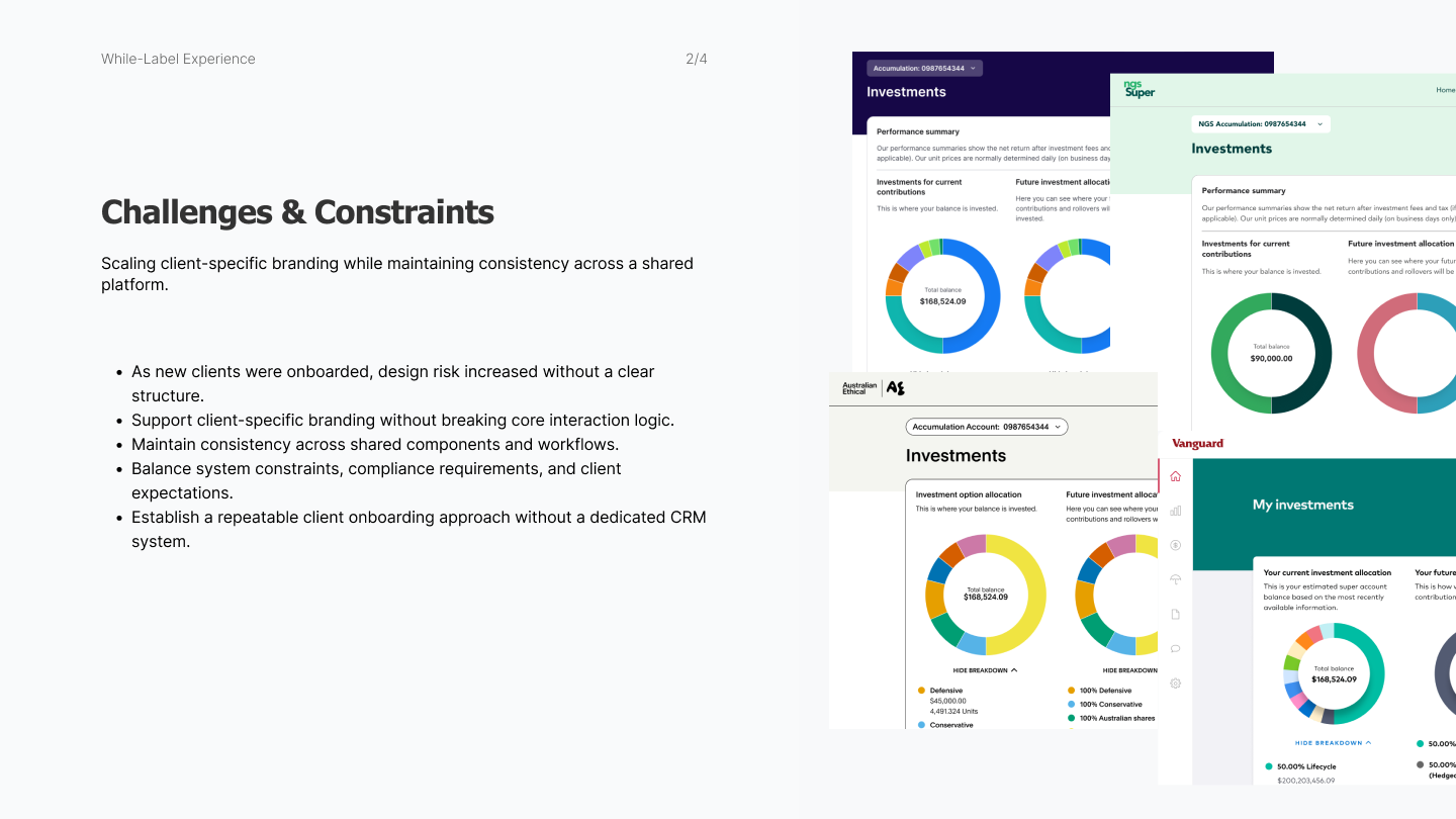
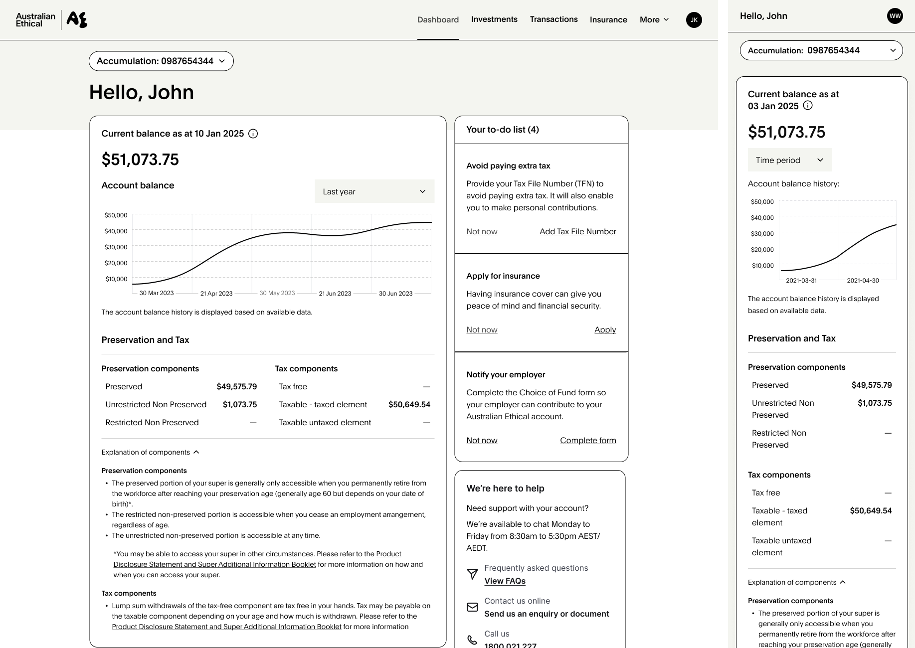
The platform served 4 clients, each requiring a distinct branded experience while sharing the same underlying infrastructure, compliance requirements, and interaction patterns. Without clear boundaries around what could be customised, every new client risked introducing design debt, inconsistent behaviour, and growing maintenance costs.
The existing component library needed to evolve — leveraging Figma's advancing design system capabilities — to support structured brand theming at scale.
My Role
Led design system governance as the solo delivery designer, responsible for all 4 client theme implementations. Collaborated with other designers during the initial Figma design library setup, then owned ongoing delivery, configuration, and cross-functional alignment independently.
All design system work was built and governed in Figma, with Miro used for client onboarding workshops and Confluence for documenting customisation boundaries and component rules.
All design system work was built and governed in Figma, with Miro used for client onboarding workshops and Confluence for documenting customisation boundaries and component rules.
Key Design Decisions
1. Scaled to themes without bespoke deliveryLed design system governance as the solo delivery designer, responsible for all 4 client theme implementations. Collaborated with other designers during the initial Figma design library setup, then owned ongoing delivery, configuration, and cross-functional alignment independently.
All design system work was built and governed in Figma, with Miro used for client onboarding workshops and Confluence for documenting customisation boundaries and component rules.
All design system work was built and governed in Figma, with Miro used for client onboarding workshops and Confluence for documenting customisation boundaries and component rules.
2. Defined clear customisation boundaries
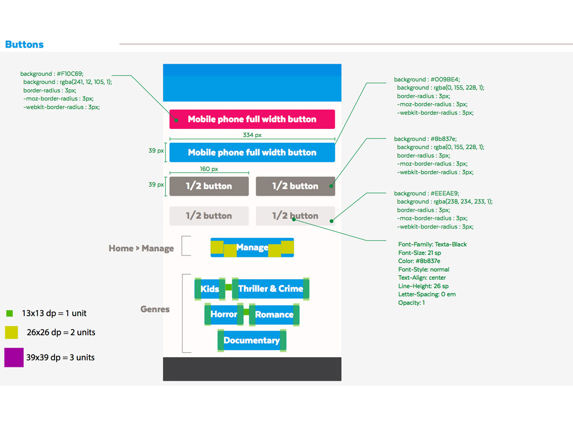
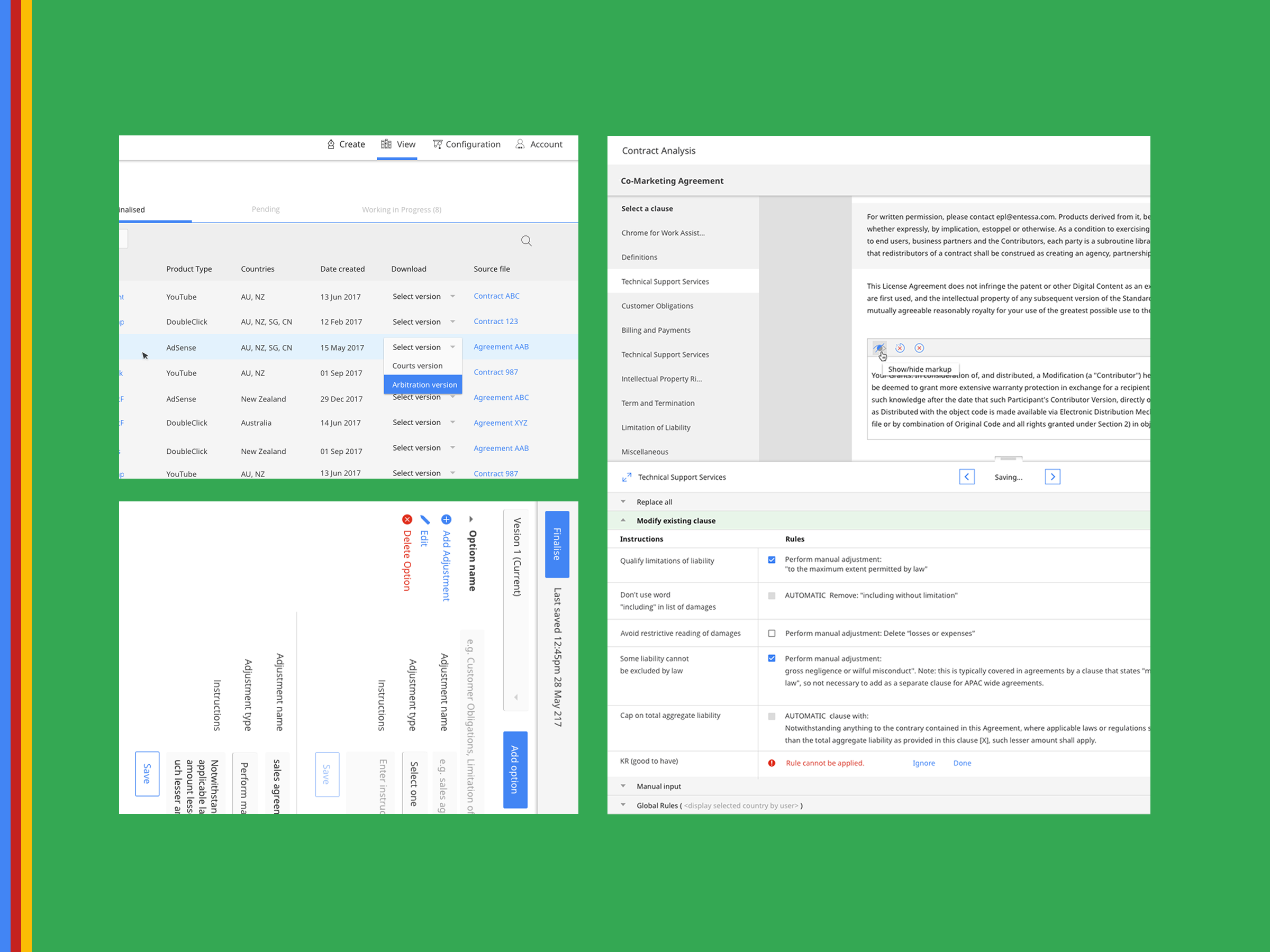
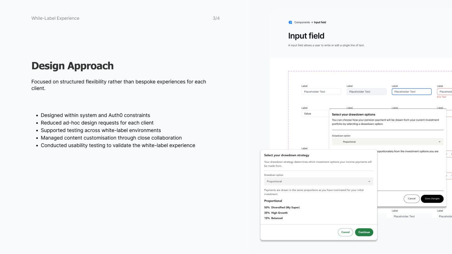
I established explicit rules for what could flex (colour, typography, iconography) and what stayed fixed (interaction logic, component behaviour, compliance-critical patterns). This protected system integrity while giving clients meaningful brand differentiation. Critically, it also reduced ad-hoc requests by setting clear expectations upfront.
I established explicit rules for what could flex (colour, typography, iconography) and what stayed fixed (interaction logic, component behaviour, compliance-critical patterns). This protected system integrity while giving clients meaningful brand differentiation. Critically, it also reduced ad-hoc requests by setting clear expectations upfront.
3. Collaborated on content customisation separately
Visual branding could be systematised — copy couldn't. Client-specific compliance requirements meant content needed individual attention. I partnered with a BA to deliberately separate this workload, treating visual and content customisation as distinct tracks to maintain momentum without cutting corners on compliance.
Visual branding could be systematised — copy couldn't. Client-specific compliance requirements meant content needed individual attention. I partnered with a BA to deliberately separate this workload, treating visual and content customisation as distinct tracks to maintain momentum without cutting corners on compliance.
Outcome
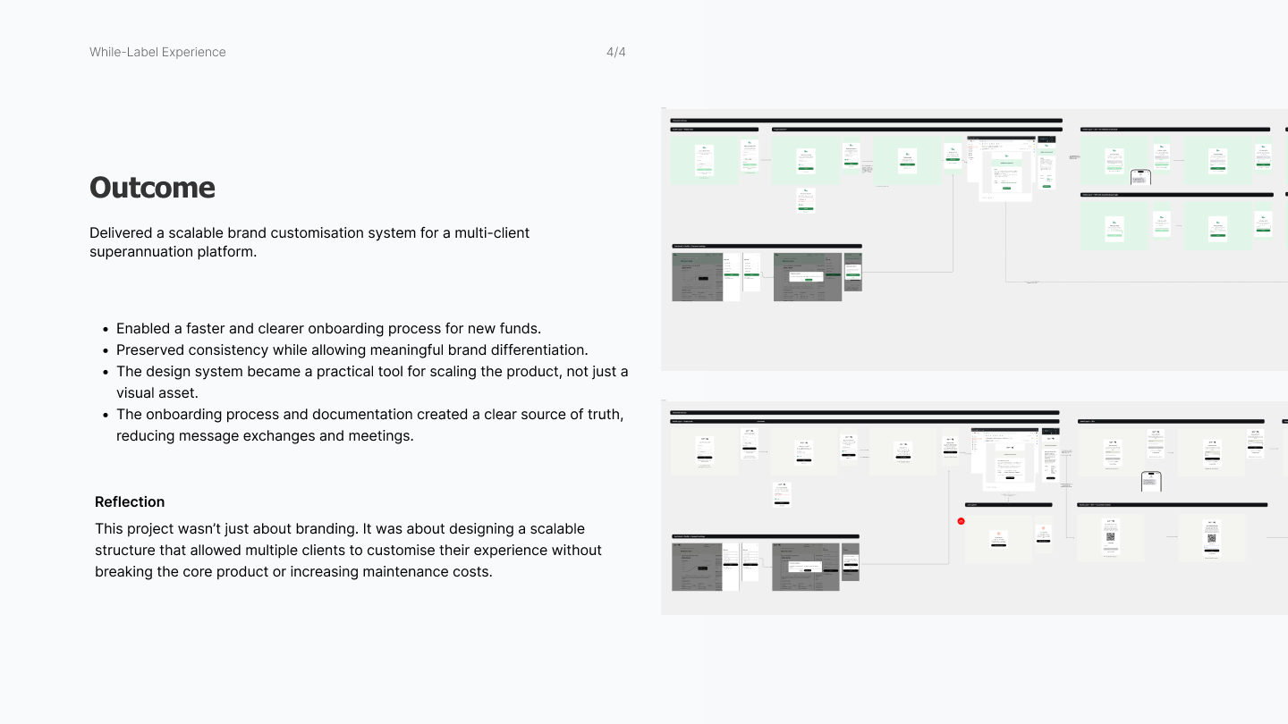
+ Governed a design system supporting up to 4+ client brand themes on a shared platform
+ Reduced design workload for new client onboarding by replacing bespoke delivery with governed configuration
+ Eliminated ad-hoc design exceptions by establishing and communicating clear customisation boundaries
+ Kept the product consistent and maintainable as the client base grew
What This Shows
I understand that design systems aren't just visual assets — they're operational infrastructure. Governing an existing system at scale, across multiple clients, requires as much strategic thinking as building one from scratch.


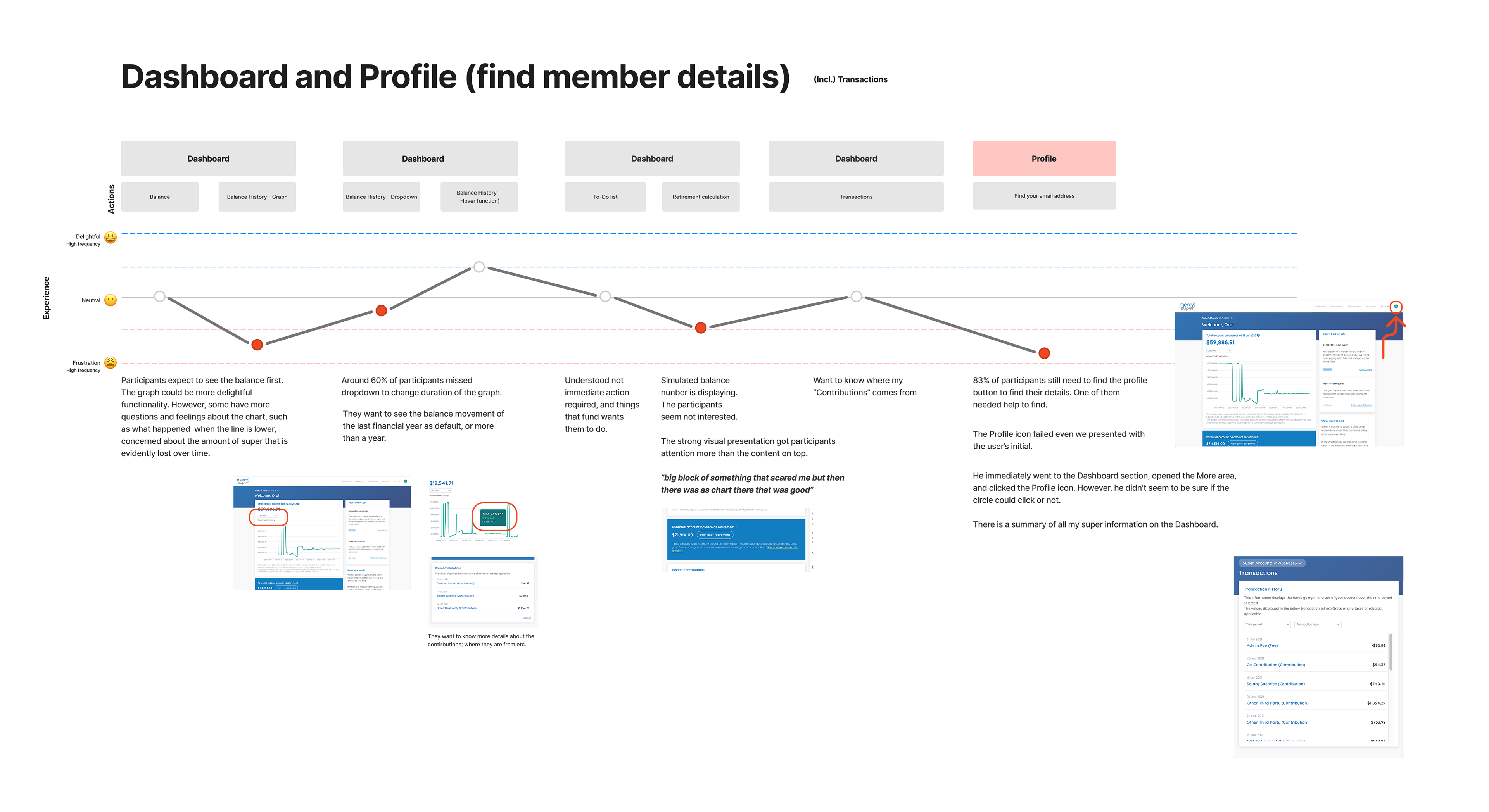
Usability Testing Insights (6 pages)
What:
We seek to measure Member Online's ability to meet members' needs, including accessibility, functionality, and use cases. To find out the differences in online experiences between the participants' own and ours. We'll know what unknown unknowns.
When:
Participants: 1 or 2 participants every fortnightly (Total 15)
Duration: 1 hour per session
Tasks to complete with the "Thinking aloud" method (verbalising their thoughts as they move through the user interface)
Whom to be involved:
In-house participants (new company joiners)
Product designer(s) / Anyone MOL squad teams (observation and questions)
How:
Online, virtual
Provide tasks ranging from general to specific to participants